OK, I'm going through the Free Study submissions, purposefully finding those images I think are shot with a less conventional eye - this is one of those images! Thanks for offering something that isn't just DPC friendly eye-candy (though of course there's nothing wrong with eye-candy):
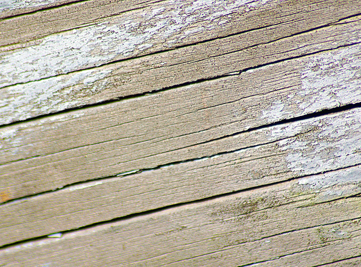
Positives: If I consider this image within the context of its original purpose (abstract macro), I can see that it is reasonably effective in offering an interesting texture to look at - in fact this might be a great image to use as an overlay.
Critical stuff: Try as I might, I can't talk myself into being a fan of this image. Technically, the focus/ DOF and the apparent chromatic aberration are distracting and artistically I'm just not convinced there's enough going on to engage a viewer.
Overall: I'm afraid I'm not a fan, I'm going to 'fess up and let you know that I'm going to give a well considered but nonetheless harsh 2. Sorry. |





 Add photograph to your favorites
 Add photographer to your favorites


 Photographer found comment helpful.


