|
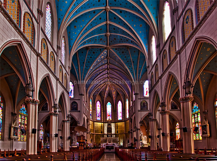
Well composed with careful attention to symmetry. The colours in the windows look as they they are somewhat over saturated, particularly the turquise, and clash slightly with the rich deep blue of the ceiling. One of those photos that I am sure would benefit from being viewed at a larger size, as it looks as though a lot of the fine detail has been lost. |







 Add photograph to your favorites
 Add photographer to your favorites


 Photographer found comment helpful.


