The Image: FINALLY A CHALLENGE IN MY HONOUR! :) Just kidding! I HAD to enter this, or my username is not hotpasta !
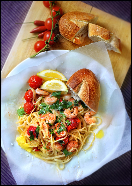
I conceptualised, cooked and styled this image in about 30 minutes...was pretty happy with the end result. I used light coming in from french doors at our house, placing the food on the ground. My dog was hovering...
I used a reflector as well.
This time, I ate the food...mmmmmmm, nice!
EDIT: Very basic editing, levels, colour, gaussian blur, sharpening adjustment layers. All the usual stuff. I added my parent's home town in the name: Ferruzzano, Provincia di Reggio Calabria. They are on the Mediterranean coast by the sea, and so I am guessing there would have been a few meals like this, fresh from the fishing boats.
PREDICTION: I am going to guess there will be a lot of macro images of pasta. They're pretty popular. I am guessing 6.2345.
Statistics
Place: 26 out of 70 Avg (all users): 6.0432 Avg (commenters): 7.3333 Avg (participants): 5.5128 Avg (non-participants): 6.2500 Views since voting: 1836 Views during voting: 295 Votes: 139 Comments: 19 Favorites: 1 (view)
Your score guess was pretty close, but a 6.04 is still an excellent showing in a challenge. Since you admitted to complete conceptualization, design, and execution of this image, I suppose I can be a bit harder on you :)
First of all, the food looks tasty and well executed in that department :) Compositionally, I'm not a huge fan of the perspective. I'm sure there is a reason you chose it, but this view is rather flat and two-dimensional. The application of the gaussian blur also feels a little uncomfortable to me as well around the top edges of the image.
I think this image is very well done for the purpose of stock imagery. It would also make good menu or restaurant art.
I personally find it more difficult to critique an image in a challenge like this one simply because of the topic. Some topics allow the artist to express themselves a little more than others. This is more of a commercial art assignment rather than a simple artistic endeavor...
The best I've seen today regarding the appropriate color of food, especially a combination of different colors. Well done ... and extremely appetizing.
When I first saw this I wasn't sure about it, as the crust of the bread seemed a bit sharp and the blurring around the edge of the chopping board seemed too soft. But on second glance I think the two cause each other. i.e. it's only the sharpness on the bread that makes the board seem too soft and vice versa. On balance I think it looks about right.
The scene looks very natural, and not at all staged. Ironically I bet it takes real effort to make it seem so effortless lol.
The colurs are perfectly vibrant and not all over-saturated. In short, this is my favourite shot of the challenge so far. Oh go on, have a 10 ;-)
Edit: I was worried about submitting a "recipe" shot for this challenge. I came to the conclusion that pasta's one of those foods that doesn't photograph well, looking sometimes like it was sort of thrown on the plate. Your shot proved me wrong :-) That said, my shot does look thrown on the plate and is scoring accordingly. If you've got a moment, would you mind having a look at my shot when voting is finished and telling me what you think? I've got a lot to learn about food photography, although it is one of my favourite sort of shots. Thanks a lot :-)





 Add photograph to your favorites
 Add photographer to your favorites


 Photographer found comment helpful.


