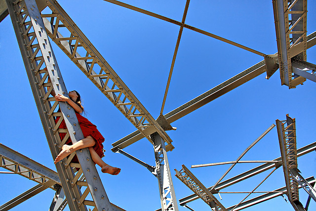
Well I was certainly disappointed with this result. The lady (12 year old Kita!!!) was placed in the image to break up the monotony of the lines....obviously that wasn't suited to the voters. Sigh!
Statistics
Place: 83 out of 238 Avg (all users): 5.4114 Avg (commenters): 6.0000 Avg (participants): 5.2500 Avg (non-participants): 5.5465 Views since voting: 1392 Views during voting: 239 Votes: 158 Comments: 9 Favorites: 1 (view)
This is neat, and I do like it having a person in it...maybe if she was positioned different..but that would be mighty hard to do under the givin circumstances. (but she has guts!)
This one caught my eye when I first saw it. I gave it a pretty good mark, would have been higher, but the dirty foot took too much attention from the rest of the scene. That's what I saw, anyway. Just didn't fit with the rest of the photo and really jumped out as a distraction. Good lines and clever idea!
Got a 5 from me. I start at 3, and I gave you 2 points for having the model look away and otherwise being subtly placed toward the edge of the composition, with face as smallest part. These are the very same reasons some other people voted you DOWN.
i quite like this one Judi - and I think having Kita in the image does add a bunch to break up the lines and create others. My only nit is that I see some apparent oversharpening along the diagonals in the upper center of the image - but I can't imagine giving this anything less than a 6 - even on a really grumpy day.
Hey, Just thought I would drop by and see what you almost withdrew from the challenge. I think this should have scored higher, but at least you got some comments. lol I didn't get any this challenge.
(what one wouldn't for a shot... crazy model...)
It's an uneasy looking: the model seems unconfortatable and unsafe there - and those loose ends are not reassuring either. It's an image that caught the viewer attention anyway and convey the message. Well composed and exposed with bright and contrasty colors.





 Add photograph to your favorites
 Add photographer to your favorites


 Photographer found comment helpful.


