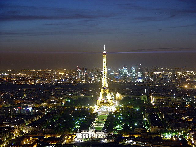
I do like the light beams at the thirds, but the Tower itself and the city/horizon are, to me, centered too much. It is a wonderful photograph, though! The lights are gorgeous and you captured them wonderfully!
I'm lovin' that upper horizontal third on the light... but the centered subject really ruins the thirds for me. If you'd cropped it off left or right to put the tower on a vertical third this would be an 8 for me. As is, it's a 6.
For me the rule of thirds says to put the main subject at one of the third locations, either vertically or horizontally. The main subject in your image to me is the tower which is centrally located. I am guessing that its the ill-defined horizon that is in the third position so I guess it still qualifies. I would be interested in seeing if the image was better if the horizon was kept in vertical third position and the tower was moved to the horizontal third picture.
This has so much potential, its just sad to see that its not really following the rule of thirds. The tower is too centered, and the horizon is also too close to the center....if those 2 elements followed the rule of thirds, it would be a hard to beat photo.






 Add photograph to your favorites
 Add photographer to your favorites


