Author Thread Comments Made During the Challenge
Post actions
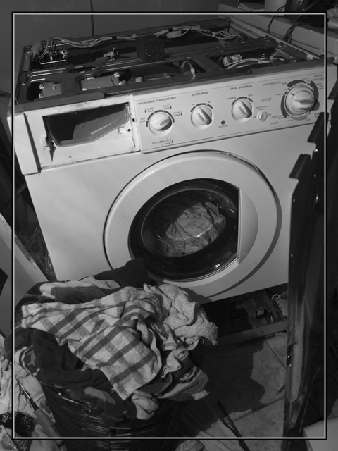
looks like you need some new ones........IMO I would not have used this border on it
Post actions
Not a fan of the frame, would prefer more contrast, good concept.
Post actions
This has a very documentary-esque feel to it. If that was the look you were going for, then you pulled it off marvelously.
Post actions
This one is topless! I like the B&W tonality with solid whites and blacks. The right side thingy is a distraction. I am not sure whether I like the border as my eye is drawn to it rather than the washing machine.
Post actions
Real life story. I like the angle, but I might try cropping it tighter up to the boarder or so, which leaves just the basket and washer pretty much ?
Post actions
I don't care for the inner border. I think it would be stronger without it. I do like the chaos and the angle, however! Seems a tad pale. Did you play a little more contrast? I'd be curious if more contrast would hurt or help the photo...
Post actions
Great. Points for the title alone.
Post actions
i see now why people dont like these borders (crap i was probably the 8th person to say that, sorry!) Works well in b&w
Post actions
Mourning is right...It is Indeed the NEVER ENDING BATTLE! This image could have used a little more contrast to really make it more dramatic, 6.
Post actions
what the effing point of the damn boundaries....it takes away so much from the pic
Post actions
I'd have added contrast and put away the top cover, unfortunately I don't think the framing works well either, 4






 Add photograph to your favorites
 Add photographer to your favorites


 Photographer found comment helpful.


