From the Critique Club:
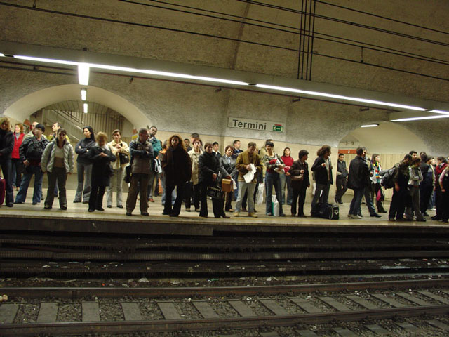
This image certainly meets the spirit of the challenge. To tilt or not to tilt! The tilt can be acceptable to display anxiety in this shot, however, upon closer examination I notice the following. Why is it that the tilt is not dead obvious? Look at the track, it is curving. In this case the tilt makes the curve shape of the station harder to detect. My personal feeling is to level it and allow the curve its effect.
Since you chose a journalistic approach there is not much more I can add. I would have examined the cropping a little closer and possibly eliminate the akimbo arm on the right, but this will not be as effective as a level horizon in this case. I think you did the best under the circumstances. If you really want to explore challenges a little deeper, I would spend time comtemplating the theme and developing several concepts. Often times, you will come up with a novel way which may attract much more attention. dan |






 Add photograph to your favorites
 Add photographer to your favorites


