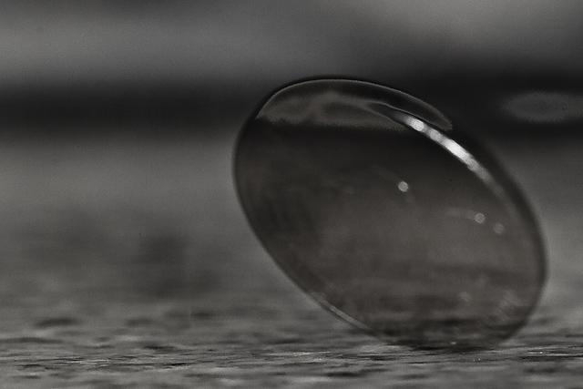
Photo taken for the DPC Circles III challenge. Placed my camera (w/ 100mm macro lens, and Ray Flash) on a tripod level with the bathroom's sink counter. With the camera on manual, I set the shutter speed at 1 second the aperture to f/11 to give a very shallow depth of field. I dropped the nickel from about 3 feet above the counter and opened the shutter after the first bounce. I took about 20 exposures in all to get the one I was looking for.
Post: Imported into Adobe Lightroom 2.4 and made the following adjustements: Temp 3771, Tint -2, Recovery 4, Fill Light 28, Blacks 58, Brightness +31, Contrast +100. Clarity +100, Vibrance +100 Saturation -99. Tone Curve: Lights +27, Darks -1, Shadows -29. Sharpening Amount 122, Radius 1.9, Detail 73, and Masking 40.
Statistics
Place: 93 out of 100 Avg (all users): 4.4375 Avg (commenters): 6.2500 Avg (participants): 3.9565 Avg (non-participants): 4.6316 Views since voting: 854 Views during voting: 318 Votes: 160 Comments: 9 Favorites: 0
I am really surprised that this finished so low. I liked this very much.
Artistically, it is very clever. Technically there are a couple of things that are wrong. I think for this challenge having the face of the coin showing up a little more would have helped. There is a lot of grain and some sensor dust going on.
One tip for the blac and white is to saturate or use selective colours and play around with those before you change it to black and white, you will be surprised at what details come out this way. Unsharp mask would have also helped to bring out some details.
OK. I gave this a 4, basically because it met the challenge topic. 4 is my minimum vote for those that meet the topic. I do like the abstract feel, but as a whole I'm not drawn in to the photo. BW was a good choice. As far as processing, the halo around the nickel is too prominent, and it is legal to clone/heal sensor dust in basic.
I want to give a big thank you to those 37 of you that thought it really sucked, but didn't let me know why.
We have one of our resident programming nerds working on a javascript that will register an electric shock through the mouse for any vote of 3 or less without a comment.
Wow, I must say that I'm extremely disappointed with this finish. I thought the creativity would've at least got me a 5, but clearly the obvious choice was the better one in this case.
I REALLY feel that there should be a requirement to leave a comment with a score of a 3 or worse. I want to give a big thank you to those 37 of you that thought it really sucked, but didn't let me know why.
Post-vote comment:
I gave this a 4. I see some good creativity and effort in it, but it didn't come off to me with a lot of visual impact or appeal. Unfortunately, that is what most of us look for and rate an entry on. Looks like you did a long exposure and moved the nickel into the frame at some point. I popped it into PaintShop Pro to see some things, and the first thing I found was the histogram is very flat on the light end. This makes the image a bit dark and lacking dynamic range. You can see in this screenshot of my levels dialog, the histogram and the preview of the difference it made.
Some noise reduction and contrast with a high radius unsharp mask gave me this result:
Of course, my quick edit brought out a lot of other visual artifacts, but it showed those aspects that I felt were the main issues with this shot.
This is far from a snapshot, and you are certainly moving in the right direction with this effort.





 Add photograph to your favorites
 Add photographer to your favorites

 Photographer found comment helpful.


