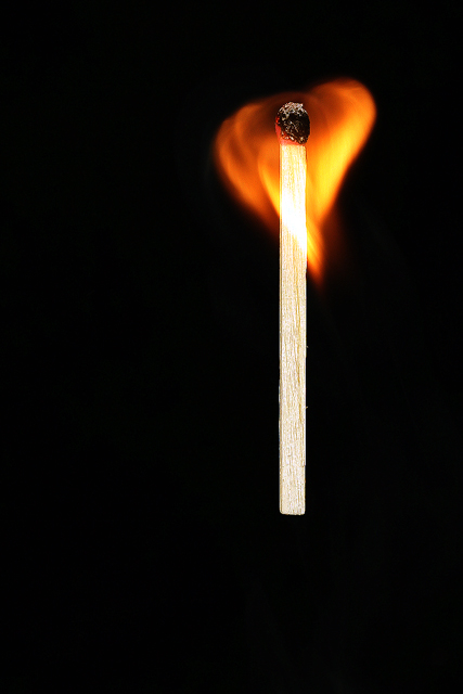
Tis just me and fire again, I started shooting toward the end of the match burn for the book title 'The Lighted Match' but quite liked this shot then when I found the book 'A Match to the Heart' I just had to enter it. Its not the best shot of the sets as the exposure isn't quite right but think it will do better than any of the images I think are technically better.
Editing was pretty basic with levels, curves, sharpening and neatimage then cropped for composition and resized <5 minutes (my kind of edit lol).
Statistics
Place: 47 out of 130 Avg (all users): 5.7563 Avg (commenters): 7.4000 Avg (participants): 5.8444 Avg (non-participants): 5.7217 Views since voting: 1232 Views during voting: 274 Votes: 160 Comments: 8 Favorites: 1 (view)
My first impression: I do really like minimalistic pictures, therefore I was an instant fan of your photo (voted 9). It exhibits a pure and flawless aesthetic.
The subject has its elemental interest. The heart shape is instantly recognizable, looks great and is consistent with the title/challenge.
The composition deviates subtly from a classical rule of thirds approach. This introduces some dynamism and tension into the picture. The match could be moving upwards, but the horizontal placement does not sustain this suggestion. Out of curiosity, I tried some 'filling the frame on the heart' approaches or rotating in order to straighten the heart. But your version works best for me. Of course, perfection would be to place the flame in the position where the heart of a human body would be ;-)
Technically it looks quite perfect. Maybe the lighting is a bit strong or too frontal, as the wood textures are a bit washed out, but that's definitively nitpicking.
Overall, my first impression stays: it is a great picture and I am quite astonished that it was not more successful. My personal conclusion: loads of negative space can be very spectacular in some pictures, but without an instant WOW reaction people do not overly like it. You might also have received some nasty shoehorn votes.
If you have questions about this critique, please contact me.
Mike





 Add photograph to your favorites
 Add photographer to your favorites


 Photographer found comment helpful.


