its got nothing to do with the image nor my critique but I hate (with a passion) titles that so obviously state whats in the image
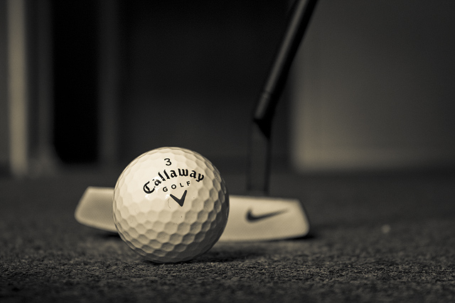
First Impression: A decent take on the challenge, B&W was they way to show this image.
Composition: I'd have preferred a tighter crop on the left to lose the bright vertical line (doorframe?) and this would have brought the ball more into the rule of thirds.
Subject: I like this and am thinking of an executive taking a break from work and relaxing a little.
Technical: The golfball is a little blown out and nit picking the focus on the carpet is maybe 1/2 inch out to make it perfect. good focus on the ball and the dof on the putter is perfect!
Final thoughts: I like it as a shot for the challenge and feel 5.2 was a little rough though maybe voters thought it was a little boring?
I like everything about this shot except that it was taken indoors. The black and white conversion is great, the DOF is perfect, focus and sharpness are good, but this belongs on a green and not on a carpet. 6 from me, but would have been higher if it was in a more golf like setting.





 Add photograph to your favorites
 Add photographer to your favorites

 Photographer found comment helpful.


