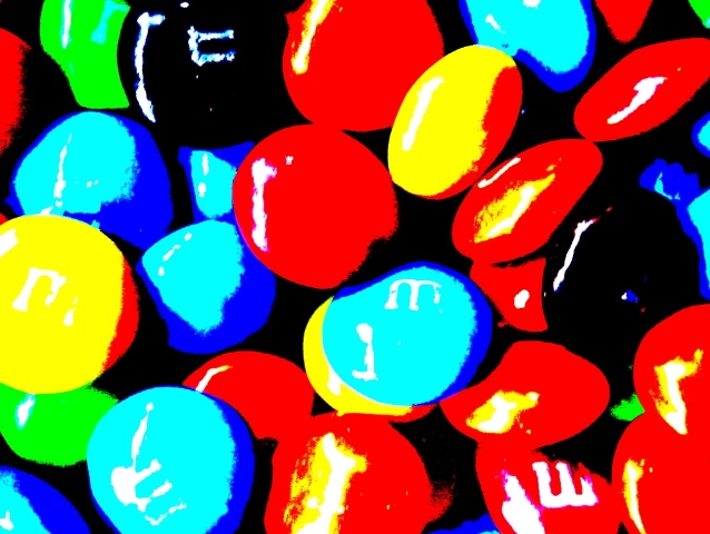
Taken in a lightbox. For editing: Levels adjustment, saturation and cropping.
After votes:
Thanks for your time on voting and commenting, I swear I wont use anymore saturation because obviously you hate it. But I honestly dont believe that mine was the worst on this challenge!!!
Statistics
Place: 149 out of 152 Avg (all users): 3.5895 Avg (commenters): 3.7778 Avg (participants): 3.4211 Avg (non-participants): 3.6617 Views since voting: 1038 Views during voting: 274 Votes: 190 Comments: 15 Favorites: 0
Initial impression: Very, very heavily saturated and shot at far too high an ISO. If you bothered to shoot it in a lightbox, presumably in a studio setup of some sort, then let us see it instead of burying it under layers of saturation!
Technical: Tying in with the above...the first thing you must do is take a good photo. Show that some thought went into it. Give us an interesting POV, some leading lines, framing, use of the rule of thirds, a focal point - then go to town with the pp, but no amount of extreme pp will make up for the fact that a bad photo is a bad photo. Yes, it really is that simple. I have brown ribbons too to prove it.
Artistic: Yes, I did read the comments both commending you and blasting you for the pop-art approach. It is too easy to embrace the positive comments and ignore those that are more critical.
Overall: I am sure there are pop-art sites out there where people would love this shot. Find them and enter these shots, but this is probably the toughest competitive photography site in the world. Enter photos!
I sometimes feel like throwing in the towel with DPC, for two reasons. Principally there is such good photography on this site that I just don't feel I'll ever make it and secondly when photo's like this get utterly dished. I think it is an expertly executed piece of pop art and an imaginative use of photography .... if people only want to see images of the real world as it is then what is television for ?
As pop-art, this is kind of cool looking and works as art. As a photograph, it is just so overprocessed that it is no longer a photograph and the voters punished you for that. As far as visual appeal, it is far from the worst in the challenge. It might have done decently in an abstract challenge. Despite the scale reading BAD<---->GOOD, there is far more that goes into many people's votes.
Well, i didn't vote this challenge nicoleangel, but i usually give low votes to shots that are too post processed, because i think it loses so much of the real beauty and "truth" of the object colors, shape and other stuff. About your shot, i like the colors and the idea of the ammount of circle candies. But i think you changed your object too much with the PP, so much that i'm not sure if the MM's are in focus and i can't even see the M's on some of them.
I think you had a good idea, not outstanding, but nice. I would try just the MM's, a little saturated and a liiiitlle changed by levels, using macro and creating a nice DOF, with each one in a different focal plane.
Hope you don't take my comment bad, i'm not very experient but i always try to help! Good luck at the next challenges!
for me this is just a little to "artsie fartsie" you are going to have a hard time with traditional DPC'rs your colors are quite vivid and bright I will say





 Add photograph to your favorites
 Add photographer to your favorites

 Photographer found comment helpful.


