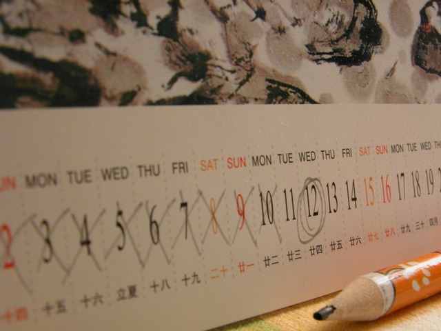
I like the idea you had for the challenge, but think you could have made a few changes to the framing or the choices for focus and depth of field to make it more strongly convey the sense of waiting.
For instance: I'd probably try a tighter crop that shows fewer days after the circled date. I'd also try a shallower depth of field to really add weight to the 12th. To me the pencil adds to the photo, but it is perhaps a bit too prominent - maybe less of it, or more out of focus would have been less distracting from the subject of the shot. My last nit would be the slight green discoloration on the table near the bottom center of the image - I think it stops your eyes there.
I like your use of color - the orange and red highlights on the calendar go nicely with the pencil and wood of the table. I also like the even lighting.
A unique take on the challenge -- I haven't seen anything like this (yet), but it fits the challenge so well. Nice choice of topic. The DOF works well with the near items on the left being slightly out of focus, but not enough that we cannot tell what it says and the "day before" and target dates are sharply in focus. The trailing numbers are too in focus to compliment the 2, 3, 4 and the tip of the pencil is out of focus. I wish you would have made your focus point just a touch closer, but maybe you tried that and it didn't work out for some other reason. Anyway, nice execution overall.
I think cropping off more of the top would accent the sense of time in this image, by forcing the viewer to look back and forth across the calendar. It's a very good interpretation of the challenge.





 Add photograph to your favorites
 Add photographer to your favorites

 Photographer found comment helpful.


