From the Critique Club:
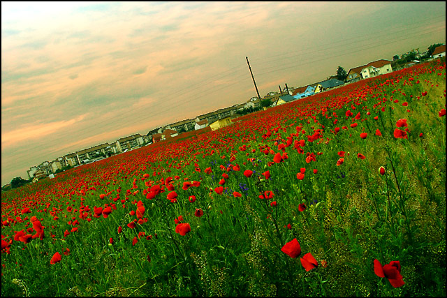
First: the red in this picture has enough strength to be its essence. The distance village frames the flower field nicely. I believe you short changed your effort by the extreme tilt of the horizon. It challenges the eye and competes directly with flowers. Be very careful when taking artistic license to tilt, the move is so important that it brings with it many new problems. The main object of the tilt is to create tension. I think this image had enough going without this alteration.
You do have a very nice image here and I would go back and realize its' full potential. You will not need to worry about rules. The minor changes I would correct are as follows. Look at the halo atop the village buildings. This is caused by extreme oversharpenning. If you use PS I would suggest you use the high-pass filter on a copy of the background. Then apply it in overlay mode. This will yield the same result as the unsharp mask, but you can always go back and adjust the opacity until you are satisfied. This is not allowed in basic editing in challenges. Next: since red is the heart of the picture be careful not to over saturate. Red is very strong and can easily tilt towards a vermillion.
In conclusion, I see a very strong picture here that can be a winner image. It has good dof; beautiful comp and that wild red to entice the eyes. dan
Nice shot. I like teh colors and the way you managed the deep DOF. I don't usually like shots that are tilted this much, but here you pulled it off with pleasant results. Good job.
Red channel oevrdone that seems to have caused a loss of sharpness... and I just can't get used to that lean. Beautiful poppy field. You are so lucky to have access to such a beautiful field of flowers.
Help, I'm falling over.........
I like the colors a lot, but, I'm not sure that the tilted horizon works here and I know I don't like the pole in the BG, you should have cloned it out IMO.






 Add photograph to your favorites
 Add photographer to your favorites

 Photographer found comment helpful.


