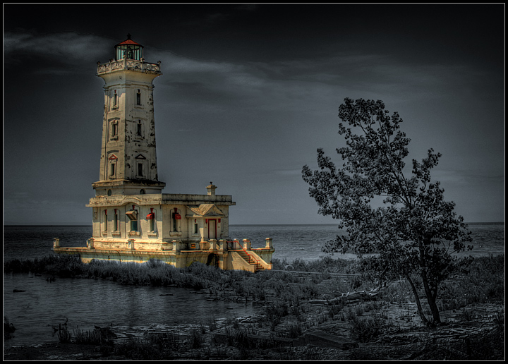
This is the lighthouse at Point Abino, near Fort Erie, Ontario. There is very limited access, as the only road there leads through some pricey summer homes of several hundred paranoid Americans.
This is an HDR composite of three bracketed exposures, treated in Photoshop with Silver EFEX and masked out on the lighthouse.
post - Thanks, everyone. I wasn't sure how this would be received, but it was still hovering around 7.0x after 140+ votes, and I was getting excited...the last dozen votes brought me back to reality. :-)
It's nice to have this one on my profile page, and a top 10 in a FS is awesome. Maybe it is a bit cheesy, but it looks great printed and framed. I've just ordered a 24x36 for our living room. Someone "wish listed" it, so please don't think I'm too full of myself if I upload it to DPC prints.
Statistics
Place: 8 out of 419 Avg (all users): 6.8535 Avg (commenters): 7.8182 Avg (participants): 6.6723 Avg (non-participants): 7.4211 Views since voting: 4632 Views during voting: 287 Votes: 157 Comments: 26 Favorites: 10 (view)
Fantastic analysis, Macrothing (sorry, you don't have your real name up in your profile). This was not the first time I've requested a CC review, but the first I've actually received one...well worth the wait! I honestly thought this would be a love it/hate it affair, but it turned in to an 8th place Love In. :-)
I took the image early on in the month, and tried a few edits...the biggest problem was that access to the location is only until 6PM, and I was there even earlier. The day was bright and sunny, and I felt the plain image lacked a certain pop. I was playing with the EFEX and accidentally erased a piece of the Lighthouse's base on that layer...well, one thing led to another and here we are.
Yes, a large print shows an immense amount of detail on the structure. As mentioned, I have a 24x36 on order, and a 12x18 at my office.
First Impressions Hmm, I remember pondering this image for a while during voting (I gave it a 5). I did like it, but the more I looked at it, as a whole and also the lighthouse exclusively, the more I didn't think the processing/selective desat suited, or rather, complemented the image/scene/lighthouse. But of course, it's your image and vision.
Photograph Information, Technicals & Composition Review Difficult, because anything I 'suggest' is going to change the image completely, but I'll 'give' anyway - perhaps mine will be a unique view, which you can take or leave as you see fit. With the image as is, I think it is stronger with a more refined crop, especially at the bottom and on the left. I'm a little OC with horizons and while I see the dilemma with the lighthouse if the image is straightened, a perspective correction may have allowed some adjustments to be made - but I'll hazard a guess that it would be difficult to do.
As for the toning, maybe just more 'soft' and subtle with the b&w tones, to allow the lighthouse to dominate more. I just wonder whether the image all b&w (and I know it is 'another image') would have more punch - but it's an out of the box type style and I'm a fan of that. It's individual.
There are some nice elements in the scene/image: the tree, the 'log' just behind it (although the angle doesn't allow that to come into play much), the clouds behind the 'light'. The greenish glass is also nice and, of course in b&w, that couldn't be appreciated.
I don't know if it is your masking and processing, but I get a 'spriteish' feel coming from certain parts of the image.
Also - glad to see you are pleased with a print of this. The details underappreciated at this size probably come into play a lot better. Would certainly make an interesting talking piece.
Comments, Score & Placement Review 8/418 - well, excellent result for you. 6.85 is also an excellent score.
An average of 7.56 from your commenters, and some interesting reactions by them. I always like the honest feedback provided during the anonymity of a Challenge.
Summary As is, with a selective desat, maybe a little softer with the tones. Otherwise, a bold and individual entry that brings an edge to the 'competition' - which is always good. You will never please everyone's eyes, as long as your eyes are 'pleased' - that's the main thing.
A technique that sometimes is overused, but it works just fine in this case. A very different and unique image using an overused technique. I also like the very slight blue color cast to the rest of the image - I believe that makes the difference here. Nicely framed, composed and executed - well done.
Wow....What an incredible shot. I had to google where this was and would never have imagined it to be a Great Lakes lighthouse. Love how the lightouse is bathed in light and stands out from the surrounding area.You must get a top three with this one. 10





 Add photograph to your favorites
 Add photographer to your favorites

 Photographer found comment helpful.