So I haven't been putting details lately since I wasn't getting scores good enough to get them looked at. I guess that changed with this one.
Thanks a ton, guys! I was really proud of this shoot, and am very glad you, too, liked it.
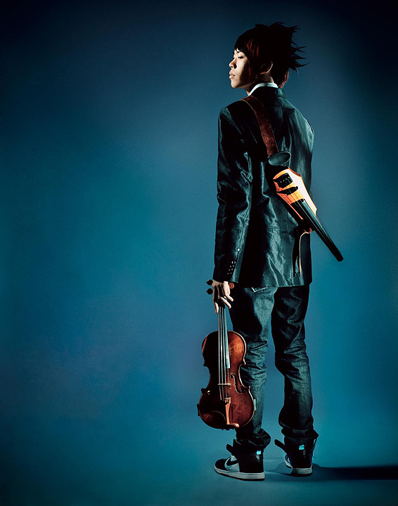
This was shot in my home studio against a purple (Orchid, to be precise) paper backdrop. From camera left, an AB-400 strobe in a beauty dish. From camera right, an SB-600, bare and aimed at the violins, and an SB-900, snooted at his shoulder/hair.
The color came from a curious post-processing effect. In Lightroom, I used the Library setting "B/W-Low Contrast," then decided I didn't want it to be B/W. When I went into Develop and turned up the saturation, I realized that part of the b/w conversion involved this odd color shift. I liked it, and ran with it. Photoshop post involved some cleaning up of shadows and vignetting.
Thanks again!
Statistics
Place: 7 out of 419 Avg (all users): 6.8734 Avg (commenters): 8.6250 Avg (participants): 6.8537 Avg (non-participants): 6.9429 Views since voting: 4482 Views during voting: 316 Votes: 158 Comments: 17 Favorites: 6 (view)
Greetings from Andi via the Critique Club.Well, how can you critique an image that finished 7th in a FS? I recognise this guy from the footwear challenge, he seems to have an 'attitude' that I'm sure will do him well for the future. I'd have liked to have seen some info about him in the photographers comments.
First Impression: The complimentary colours help add 'mood' to this image as do the deep shadows.
Composition: A good choice of model placement, as a square crop this would easily do well as a cd cover.
Subject: Always nice to have a fresh take on a portrait, the image conveys the violinists attitude well.
Technical: Spot on with the techincals, a bright and modern image. My only thought would to have had more light on his hair as it lacks some detail on my monitor.
Final thoughts: An excellent 'product' shot and I'm sure you are both very pleased with the result.





 Add photograph to your favorites
 Add photographer to your favorites

 Photographer found comment helpful.


