Greetings from the Critique Club -
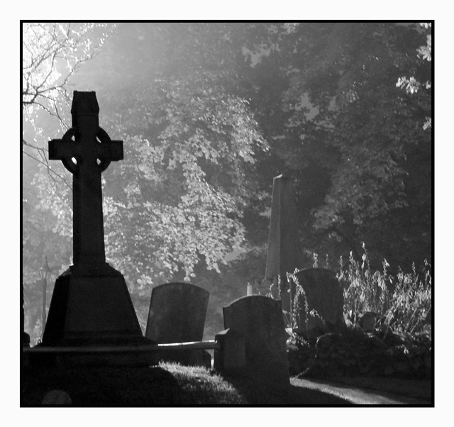
I will start off with the fact that I gave this a 7 - which in a dismal challenge was one of my higher votes. I like the graininess, I like the varied levels of shadow going back. I may have punched it even darker making the front stone almost a true silhouette. It doesnt have anything really standing out to say "WOW" but I felt it stood out well in the challenge.
My biggest issue is the border. You have this dark gloomy image wrapped in a bright white border. I would have probably gone with a black border or no border at all. It is just an odd combo in my eyes.
I figured this would have placed higher. Whatcha gonna do.
Tim |






 Add photograph to your favorites
 Add photographer to your favorites


 Photographer found comment helpful.


