CC Club here!
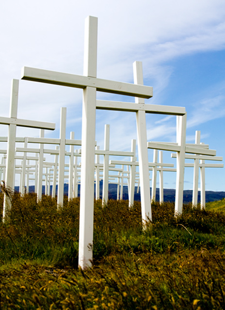
What a sad picture.
1st impressions are that your horizon is slightly tilted, it needs straightening out. Maybe a little saturation or selective colour to make the blues, yellows and green pop a little more. On the left hand side a crop that doesn't cut off the cross may help the viewers eye as well.
Good placement, well done |






 Add photograph to your favorites
 Add photographer to your favorites


