Greetings from the Critique Club
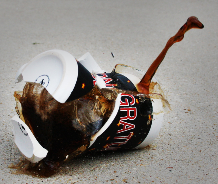
First Impression: Creative take on this username. I like the idea very much, although it possibly falls into the "water drop" category.
Composition: The composition works well, although possibly I would like to have seen more background to give a bit more context.
Technical: Here I think there is some room for improvement (when considering a higher score on DPC). I expect unless you had a whole cupboard full of cups that you were prepared to break into smithereens, that you didn't have too many chances to get this bang on the money! For me the lighting seems very flat and makes the image quite dull. I'm not sure how you could overcome that without blowing the highlights in the cup. (I'm not that technically competent that I can offer solutions). I do think this is the main reason why it only scored mid-5.
Overall I like the image, it's a good subject for this challenge and with some improvements in lighting/processing I think it could have scored higher. It did not realise it's potential.
|









 Add photograph to your favorites
 Add photographer to your favorites

 Photographer found comment helpful.


