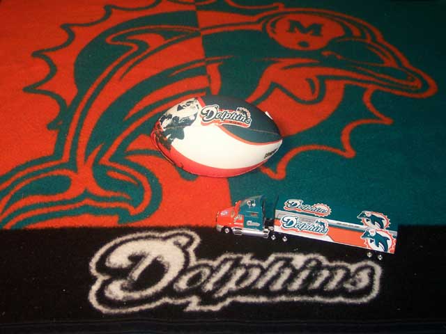
Sorry, but this isn't the strongest effort of the competition. The highlights on the ball, truck, and rug/towel are overblown. The composition lacks interest, with just too many places to put my eye, and a vacuum would help overall.
I can tell you put some thought into the composition on this one. However, the image seems a bit flat to me. I'm not sure if it's the lighting source or maybe it's too compressed (either when you resized it or your camera has low megapixels). The colours are obviously rich in real life, but fall a bit flat in this image (at least on my screen).
This is a very cluttered arrangement. The logo and the color tie the objects together but nothing else is harmonious in this composition. The lighting is very flat. There is very little sense of space or depth. The eye doesn't know where to rest. Keep trying.
This image lacks focus. I think it would really only be relevant to people that follow the Dolphins. It's a good idea but it hasn't quite made it in this case. Better luck next time.





 Add photograph to your favorites
 Add photographer to your favorites


