|
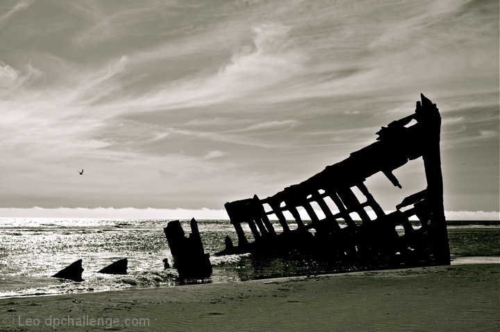
This has some overall artistic impact, but the variations of contrast and the extreme under saturation of color are jarring and not at all pleasing to the eye. This might have worked much better with a little more exposure to extract some details of the wreck and much more tighter control over the background which is washed out and rather straight. It might have been a better approach to try different angles viewing through the ribs of the vessel or maybe even along the length of the wreck. A little more thought would have helped a lot. |






 Add photograph to your favorites
 Add photographer to your favorites




 Photographer found comment helpful.


