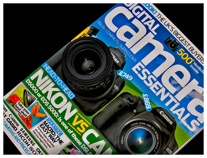
Nice idea. You can accentuate the three dimensionality of the lens by choosing a lower camera angle to create a new perspective in which the front of the lens extended past the left edge of the magazine.
It's a very clever idea, but it's not quite obvious enough. A slight change of angle so the lens protruded over the edge of the magazine might have helped.
It appears as though you just placed a lens on the cover. However, it is very difficult to actually see that. Perhaps a different perspective would have made it more clear and given it greater impact.





 Add photograph to your favorites
 Add photographer to your favorites

 Photographer found comment helpful.


