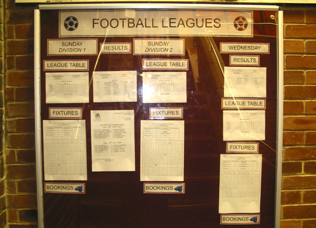
Football Fixture Board hung on wall.
Level adjustments/crop.
Not expecting high marks (flash/reflections in glass?). But if any improvements on marks for my 'multiple light sources' submission (first one ever made) then a step in the right direction :-)
Statistics
Place: 158 out of 162 Avg (all users): 3.8490 Avg (commenters): 2.6154 Avg (participants): 3.6154 Avg (non-participants): 3.9517 Views since voting: 815 Votes: 298 Comments: 15 Favorites: 0
Thanks everyone. Some really helpful feedback in the comments. Lots of good suggestions. I will be taking them all on board and hoping to improve on future submissions. (Didn't get around to a submission for the'Waiting' challenge, but will put more in along the way).
a few comments.. first of all, always avoid taking a picture dead on for several reasons.. One, you get a very bright central flash that can wash out the center and make the edges dark and vignetty. It can also be a problem with reflective surfaces such as this one, where it bounces back to you and removes the invisability of the glass (and the photographer). It's also just very boring, because there's very little texture and shading with the light. Furthermore, pictures are nearly ALWAYS improved when taken to the side of an object, as opposed to completely centered.
A nice relationship between the photograph and the competition theme. A stark view of lists demanding players. Looking at the cracks in the glass. Associate with lightning ending the presence of players. This is well framed.
The harsh light in this is very distracting and doesn't add anything to the composition. The colours are a bit off - almost like the white balance wasn't metering things properly. Also, taking a photo like this dead-on and centered doesn't add a lot of drama to the composition. Think of things like depth of field, rule of thirds and using negative space.
This is an extremely mundane subject. The glare and reflections on the glass don't help (you really need to use a polarizing filter to shoot a subject that is behind glass -- sometimes shooting at an angle can help reduce the glare and reflections).
You've tried here and I can see what you were planning, but unfortunately the subject matter just isn't very interesting. You should investigate techniques of cropping images to bring out the subject. The reflection and flash spot are distracting.
white balance seems off, some shape distortion, harsh light in the center. If you used flash might have done better with a long exposure rather than the flash






 Add photograph to your favorites
 Add photographer to your favorites


 Photographer found comment helpful.


