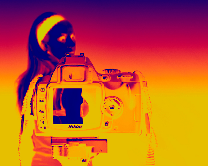
I had to go for a radical edit on this one as it was impossible to get both the model and the camera in focus without focus stacking.
I took a photo of the model in her bra and then tried to play it back on the screen. However, the reflections from the glass screen were terrible so I ended up printing it out at the right size then sticking it to the display. My studio is a spare bedroom so is very small. It was difficult to get the screen pic to place right for the model with limited space. It is not quite right but the best I could achieve under the circumstances.
I played with this image for so long that if I get a request for proof I am going to struggle to recreate the steps. I just hope the thermal image filter thingy in Nik tools for CS4 is legal in advanced.
This will either fly or bomb. I am expecting low 5's due to the amount of processing. But at least the thumbnail will draw attention.
Statistics
Place: 16 out of 43 Avg (all users): 5.7426 Avg (commenters): 7.0000 Avg (participants): 5.0800 Avg (non-participants): 5.8022 Views since voting: 2285 Views during voting: 658 Votes: 303 Comments: 15 Favorites: 1 (view)
I must admit that when it came up on my screen, I was shocked by all the colors. In a good way. I love the bold editing.
I think your composition is good. I also like the negative space on the right, there is enough room that neither the model nor the camera feel cramped. I really like the difference in DOF between the model and the photo on the display; it created a nice contrast between the two.
My biggest problem with the photo is that the alignment of the photo on the display is a little off and does not line up with the model (it seems a little high). I would have also liked to see more details on the camera and camera straps, so that the camera straps don't disappear into the yellow background.
You've done a great job with this photo. Feel free to pm me if you want any clarification.
This is one of the photos that I have bumped up upon second view. Very cleverly done, I must have missed the point the first time. Definitely meets the challenge, well done!
This is a good idea but it didn't come off too well. It would make much more sense if only the photo in the back screen was a negative and everything else was a regular image.





 Add photograph to your favorites
 Add photographer to your favorites


 Photographer found comment helpful.


