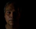
Shot was taken out of focus on purpose. PP'd in Lightroom. Curves and Colour. Added two extra layers in Photoshop with added selective blur. Some dodge and burn.
Statistics
Place: 149 out of 159 Avg (all users): 4.4183 Avg (commenters): 5.6250 Avg (participants): 4.4464 Avg (non-participants): 4.4021 Views since voting: 1008 Views during voting: 322 Votes: 153 Comments: 12 Favorites: 2 (view)
After not playing critique club for YEARS, something compels me to press the button ...
and your picture appears ... beams down .... the picture only becomes more sublime each time I look at it. The fuzziness of the photo is because *I* am not good enough to see it.
There's an important point to be made here. The picture is only pixels ... and what it evokes in a reader. A perfectly focused picture that hides nothing also leaves nothing for the reader. It might as well be a Stop sign. All the reader does is STOP. To make a reader THINK takes something more... or rather, less.
Now I could go back and change all the "reader"s to "viewer"s, but you'll catch my drift.
The deep red in the background and the ivory quality of the flesh do indeed evoke Jesus... not the man, but the icon. The man is hiding, as you so aptly demonstrate with OOF and framing. I like this picture better every time I look at it, because it's getting farther and farther away, and I imagine I'm seeing something that's getting closer and closer to you.
oh wait, you asked for a Critique Club Critique. I'm poorly qualified, but I'll give it a go:
Dear Clive,
In a portrait, we expect to see a face. The less face it has, the less portraity it is. That could explain some of those low scores. Also, the face seems a bit out of focus. I wonder if this is a self-portrait. Perhaps you couldn't see through the lens as you were taking the picture. That would explain a lot. Next time, I would suggest having someone sit in the chair first, so you can focus on that person. But here's the important part: that person must get up and you must sit in the SAME CHAIR. Also, be sure to pick someone who isn't significantly taller or shorter than you are.
Ok, there you go! Your scores will be skyrocketing in no time!
This is almost perfect, so you get a 9. I just don't quite like the color of Jesus, there. And the eye is some sort of weird purple. Other than that, it's fantastic. And I don't know why he makes me think of Jesus. Just similar to typical depictions, I guess.
Very daring image for the dpc crowd. The half face framing seems a little cliche, but the softness and processing kind of offsets that for me. I like the tones throughout. For me, overall, gutsy and interesting, I like it. Nice job. Good luck with the rest of the voters! :-)
Must be the OOF challenge. This is the second intentionally blurred portrait I've come across. This challenge is turning out to be more interesting to vote on than I expected.






 Add photograph to your favorites
 Add photographer to your favorites

 Photographer found comment helpful.


