Critique Club
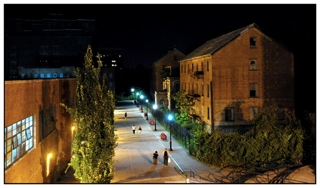
First, I enjoyed your portfolio, plenty of good work. Particularly this!
FIRST IMPRESSION:
Does not grab, as you said, bit out of the box for what I was expecting for street.
COMPOSITION:
Excellent. The right building is positioned well. The inclusion of the distant buildings buried in dark hurts IMO.
TECHNICAL:
I really like the way you capture the detailed lighting of the main building. Highlights it's texture. Drawback...the bright lights far off on the leading lines. Visual competition!
You know, when I sit here looking through the photograph, I'm drawn to the architecture of the main building, and for that reason it does not feel *street*. But you knew that based on your comments in the description. :)
Cheers,
Ben
|





 Add photograph to your favorites
 Add photographer to your favorites


 Photographer found comment helpful.


