A bit subtle for the DPC crowd, but what the heck. I like the layers of experience.
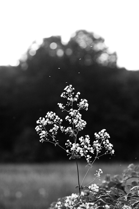
Calculations to b/w. That's about it. Maybe some curves.
This picture reminds me of another picture of mine that I think uses the same flower. A free poem for the first person who guesses it.
========================
This Old Field for Karen
This old field was here before the war.
They say it was a cemetery once,
but nothing like a bone’s been dug up for
as long as I’ve been living. Kids who hunt
for arrowheads have better luck. It seems
the natives liked this spot for settlin’ in.
Creek’s not far away. The current teems
with salmon, even today. I see their fins
break water like they’re little sharks, eager,
strong, relentless, like the creek itself,
as you can see from here. No ghosts, no meager
regrets of what’s been lost. It’s just a shelf
of meadow with good sightlines every side,
where stubborn thistle flowers scratch the sky.
Statistics
Place: 228 out of 255 Avg (all users): 4.8723 Avg (commenters): 6.0000 Avg (participants): 4.9341 Avg (non-participants): 4.7600 Views since voting: 973 Views during voting: 224 Votes: 141 Comments: 16 Favorites: 0
Composition When this image first loaded on my screen I saw primarily the top white portion of the photo. Then, as I scrolled down and saw more of the flower, the compositional feel changed dramatically. This was a result of a square crop which really helped the photo out the most. The nicest part of this composition, and what really sets this from many others is that the image is not static; its not just a photo of a flower. Rather, there is distinct motion as petals (or pollen?) are floating around the flower. This really adds a sense of tranquility to the photo. The flower is nicely isolated from the background. I think a horizontal crop may have worked better with more open space to the left.
Technical The focus is sharp; the 4.0 aperture was definitely a good choice. There is the right amount of DOF to isolate the flower, but still have enough of the foreground elements in focus. The black and white conversion really works with this photo as this photo has elements in almost all zones. The main problem, and what probably brought the score down, was the white negative space on the top. It really doesn't add to the photo and distracts from the central composition.
No cigar, and not even a free poem to light it with! (That's what I get for being satisfied with a superficial ressemblance between a compositiae and a ranunculus (thalictrum)).
The flower shows nicely against the dark background, and your method of B&W conversion works well for the subject. I am less convinced by the composition, which to my eyes doesn't really compliment the subject, and appears somewhat dull.






 Add photograph to your favorites
 Add photographer to your favorites

 Photographer found comment helpful.


