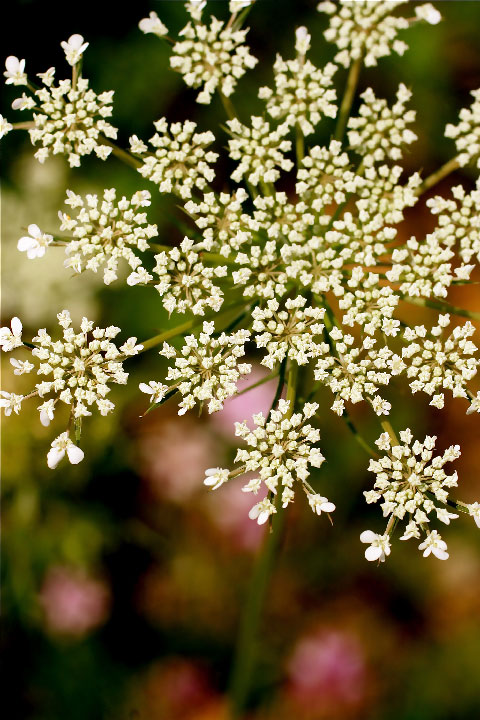
i really like the composition here, and the simplicity of the image. the muted colours of the background provide a pleasing foil to the flower head, and there is just the right amount of separation between the two.
The background is not uniform enough for my tastes -- I think something in the background that adds more contrast to the petals would have worked well -- a darker colour. I find the red/pink hues in the background distracting and they are drawing my eyes away from your focal point.






 Add photograph to your favorites
 Add photographer to your favorites


 Photographer found comment helpful.


