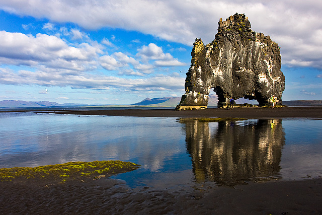
Ég valdi hluta af myndinni með lasso, bjó til adjustment layer og valdi Curves til þess að auka kontrast (himininn og sjórinn vinstramegin). Svo notaði ég Brush á layer maskann til þess að draga úr áhrifunum þar sem þau áttu ekki að vera. En eins og stendur í reglunum, þá má þetta ekki: You may not use the marquee, lasso, or similar tool to select a portion of your image for any reason other than cropping or creating a border. Maður gerir þetta annars mjög oft og hefur komist upp með það hingað til :)
Vó frekar fúlt, sérstaklega efitr fyrsta borða. Hvað návkæmlega gerðiru rangt. Bara svo við hin getum passað okkur í framtíðinni. Annars mjög flott mynd sem hefði notið sín vel í fyrsta sætinu.
Já, þetta getur gerst þegar maður tekur ekki þátt í keppnum hér nema öðru hverju og gleymir að lesa reglurnar aftur :) Ég klikkaði á einfaldri myndvinnslu sem ég geri oft á dag á hverjum degi, en myndin stendur fyrir sínu samt sem áður.
Takk fyrir allar góðar óskir.
First Impressions First impression is "oh cool, the Blue Ribbon image". That pushed aside, second is I admired this image the other day, my 'first impression' then was: what an awesome geological formation. Definitely well titled and indeed looks like a creature.
Photograph Information, Technicals & Composition Review Composition wise I like the placement of the creature and also the placement of the colors within the image, they provide good visual balance. The reflection is well retained and the cloud formation leads the eye to the creature. The image overall looks like it needs a whisker nudge up on the left but could be a perspective correction option instead.
Despite not being able to see much detail in the rock itself, the mass and formation of it speak for itself. Part of the interest is in the shape the rock has formed, so going in closer would lose that aspect and be an entirely different image (although I'd hazard a guess, still very unique and interesting).
Comments, Score & Placement Review First place - can't be complaining. I did look at the other image of this formation by Brin and, while an excellent image, shows a different scene and creates a different mood and feel entirely.
Some commenters mentioned the people, luckily I think they're subtle enough that you get away with it. Perhaps waiting for them to disappear next time - if that opportunity arises.
The commenters loved it - it's a Winner.
Summary Nice lighting and capture of the hoovering mammothorhinotriceratopsyak. I like the bird elements and wonder about a slightly tighter crop to allow them to come into play more, but that is 'another image'. Thanks for sharing this image showcasing more of your country's amazing landscapes.
Congratulations:) Gaman að vinna í svona harðri samkeppni - við erum nú ansi heppin að búa á Íslandi innan um þessa frábæru náttúrufegurð! Well deserved price Palli.
Wow, this came as a surprise! My best score was 11th place up to now and there was some heavy competition in this challenge. Thanks for your comments and kind words :) I am quite happy with my first Blue :)
A great image, good reflections. Maybe the rock formation is a little too far to the right and the person in front a slight negative, but a really good image for this challenge.
This image is a great piece of geology, I have seen some similar ones along the Oregon coast. The only thing that I would change is the one person in the picture... now that I see him, I think it takes away from the photo where he is at.





 Add photograph to your favorites
 Add photographer to your favorites


 Photographer found comment helpful.