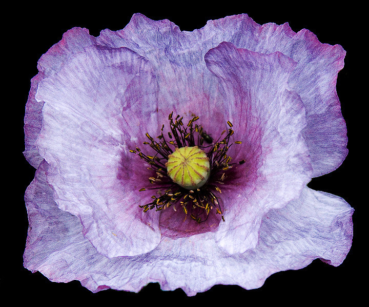
This is a really good photo. The subtle tones of the purple textual petals really interacts well with the yellow stamens?...well the center part of the flower. I hope that this photo scores high.
8 - This is very 'full on' but I think it would be excellent as a feature print, framed appropriately. I really like the detail and texture you've captured. I only noticed the bug on the second look - 'if only' he/she were in focus too, or maybe not... who knows - works well regardless. I find it a little odd, as mentioned above, that this borders on a spriteish kind of image, without a stem showing, etc - but again, I think it would have a place in 'prints'... if that makes sense.
I love the colours of this poppy - no idea if they are natural or manipulated in PP, but if they are real, I want one for my garden! You have allowed the papery texture and graininess to show through well, and your choice of dof allows the whole of the flower head to be in sharp focus, which works well for this study. I am somewhat unsure about the black back-ground - because there is no stem or foliage in frame it does give a rather stark, de-capitated look.
What a gorgeous shot. Feels like a colour pencil drawing or pastels. Beautiful detail and structure. The only thing, the black background makes it pop out, but also kills a bit of the elegant mood of the flower. Perhaps trying a dark blue or dark purple background or some pastel colour to keep the feel of the delicacy...
I like the effect and how the petals look like paper. The center could use a bit more light though and I think you could have tried a bit more of a creative angle than just straight above. 5.








 Add photograph to your favorites
 Add photographer to your favorites


 Photographer found comment helpful.


