I HATE flower photos... looking at them AND taking them. So bloody boring.
One day left and still hadn't taken anything, and I had to on account of the Formula DPC side challenge I'd committed myself to.
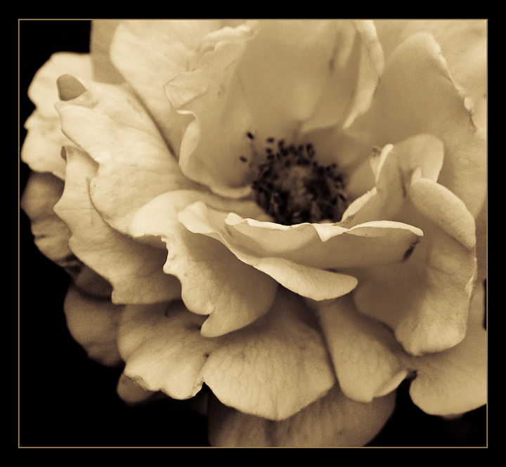
I went out to take some photos and only had to walk around the corner from home and came across a neighbours garden that happened to have a few flowers despite it being a bitterly cold winters day. Knocked on their door to ask permission to take photos in their driveway. Four or five snaps and I was on my way back home.
Then, while the kids watched "Harry Potter and the Chamber of Secrets" on TV, I imported the image into LightRoom and had a play. Then added a border with Fireworks.
Prediction: 5.2
Statistics
Place: 157 out of 255 Avg (all users): 5.5111 Avg (commenters): 6.1667 Avg (participants): 5.5287 Avg (non-participants): 5.4792 Views since voting: 922 Views during voting: 216 Votes: 135 Comments: 10 Favorites: 1 (view)
I really like this shot. The crop, the processing and the composition.
Certainly it could have had a greater DoF to include the centre of the flower . . it could also have had more bighting sharpness . . but as Melethia says - there is a lovely gentleness about this picture which is aided by the toning.
My only nitpick is your title. For me titles are always important, (not that I'm great at them before you look) but they give the viewer an idea of what you are trying to capture and convey . . the message you want them to take away, or a context / framework to position the image in, even just a factual description of the object.
While this title may well have been intended as gently self depreciating, there is always a danger that it suggest you don't really care - and you know what ? If the artist doesn't really care - then why should the viewer ? You have a good range of titles on your other shot's and I think a shot as nice as this deserved more than 'Just another flower' ;- )
LOL! I just drew you from the Critique Club... I've already commented on this twice, though, and you know I like it...
OK. Got an 8 from me. I loved the slight raggedness of the bloom, and as I mentioned before, the gentleness this conveys to me. I, being me, of course love the monochromatic nature (flowers can be quite lovely in monochrome, says me.)
So why the 5.5? Your commenters provide a bit of a clue - some people hate borders, some what deeper depth of field, and some, though I simply cannot understand them, don't like flowers in monochrome. Oh, and you've gone and allowed grain in the photo. What were you thinking? :-)
Anyway, hope this provides a bit of insight. If you have any questions, please don't hesitate to PM me.
I think I would prefer it without the border. But this photo is very beautiful. The color is so ambient (is that a word??). I would love to have a print of this (minus the border).







 Add photograph to your favorites
 Add photographer to your favorites


 Photographer found comment helpful.


