| Author | Thread |
|
|
11/12/2009 06:39:33 PM |
|
 Photographer found comment helpful. Photographer found comment helpful. |
Comments Made During the Challenge  |
|
|
07/07/2009 08:42:22 PM |
|
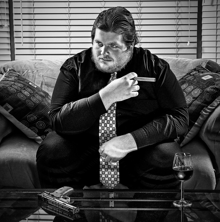
really like the rich tone in this |
|
| Photographer found comment helpful. |
|
|
07/07/2009 11:34:07 AM |
|
Excellent Lighting and post processing. (even though that looks like a pellet gun :-p |
|
| Photographer found comment helpful. |
|
|
07/06/2009 05:23:19 AM |
|
Cool pic, nice set up. I am not a fan of all this hdr filter stuff though, especially not on people. |
|
| Photographer found comment helpful. |
|
|
07/05/2009 08:48:22 AM |
The processing has given this a slightly unreal look, which isn't necessarily a bad thing here as it has taken on a movie poster feel.
Love all the props, the whole thing just works! |
|
| Photographer found comment helpful. |
|
|
07/04/2009 07:48:45 PM |
|
Very slick presentation. You know what you did right so I'll just focus on a couple minor issues that jump out at me. First, the light on his left hand, (i.e. the streak). That should have been spotted and fixed. Also that same hand would look better had it been relaxed rather than clenched especially given the location of the hand. :) Also, if it was relaxed you could have shown a nice big ring that could have served as a double entendre. Other than that the technicals are flawless, a very professional image. |
|
| Photographer found comment helpful. |
|
|
07/02/2009 11:04:59 PM |
|
Wow ! excellent lighting and contrast. 8 |
|
| Photographer found comment helpful. |
|
|
07/01/2009 04:54:19 AM |
|
great b and w conversion...lighting and detail are fantastic 8 |
|
| Photographer found comment helpful. |
Theme:
Classic /
Light /
Dark
Home -
Challenges -
Community -
League -
Photos -
Cameras -
Lenses -
Learn -
Help -
Terms of Use -
Privacy -
Top ^
DPChallenge, and website content and design, Copyright © 2001-2026 Challenging Technologies, LLC.
All digital photo copyrights belong to the photographers and may not be used without permission.
Current Server Time: 10/16/2026 12:51:21 PM EDT.







 Add photograph to your favorites
 Add photographer to your favorites


