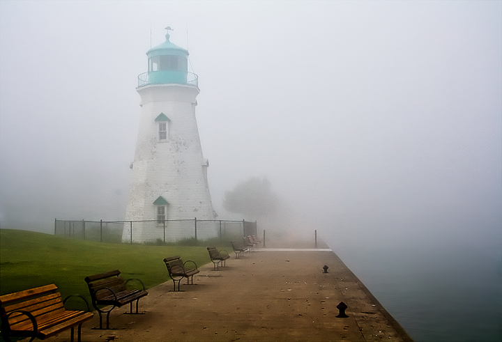
I feel the contrast on the lighthouse is a little low, I understand it's partially obscured by the fog, but it is the main subject so I would like to have seen it a little clearer.
The leading lines of the bottom left is good. But there's a lot of dead space on the right side of the image. Maybe cropping out some of the right would have helped, or trying a portrait framing instead of the landscape framing. Maybe cropping out the right half down the center of the walkway so that the lighthouse is emphasized. The fog creates another problem in that the lighthouse (the main subject) is muted so that the visual impact of the lighthouse gets lost. I'm not a big post processor so I don't know what could have been done to brighten up the teal color of the lighthouse. If the lighthouse could have been "brightened up", that may have made this a stronger image. Good luck on the voting.





 Add photograph to your favorites
 Add photographer to your favorites


