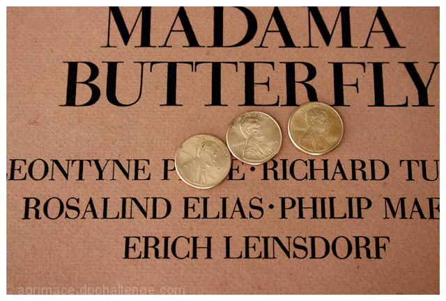
Well, you have definitely met the challenge here. And, your idea, in theory, is a creative one. However, in execution, there seem to me to be a few things lacking. There is a lot of detail lost in the pennies. Also, everything seems to be just slightly tilted a little. Beyond that, your photo doesn't include many interesting elements - just some words and some pennies. I think you need to find something to add interest here. If you showed the edge of the program, you could also find some other element from the opera to include off the edge. Finally, everything seems to be very monochromatic.
Too contrived for my liking.....I don't wish to sound harsh or mean but I don't think you're letting your camera do more than a scanner could. Good luck on the next challenge
Like this very much. Are you a collector or were you lucky enough to have seen the performance? Price and Tucker! WOW! Great idea and very nicely shot.
Hmm, the three penny opera is by Kurt Weill, not Puccini. And a performance with Leontyne Price and Erich Leinsdorf is probably nowhere near three pennies to attend :-)). So I don't get what you're trying to say here. As a photograph it's not really interesting, there's a lack of colors, the pennies seem a bit overexposed, cropping is somewhat unfortunate in hurting the lettering, and the composition is too heavy on the right side, both in lighting and in text.
The pennies could use a little more focus. The idea is great, and the play on the title is tremendous. The real thing that could be improved is the color on the sign, as that isn't that interesting, but that isn't your fault.
Gold pennies!
Interesting idea, I don't like how the Madama is cut off on the top. Penny of the left seems a bit overexposed, I would like a more even lighting. Fits the challenge well.
Cool idea! I would have maybe straigtened a bit more and cropped a little less. I think I might like it more without the border or a darker one perhaps.







 Add photograph to your favorites
 Add photographer to your favorites

 Photographer found comment helpful.


