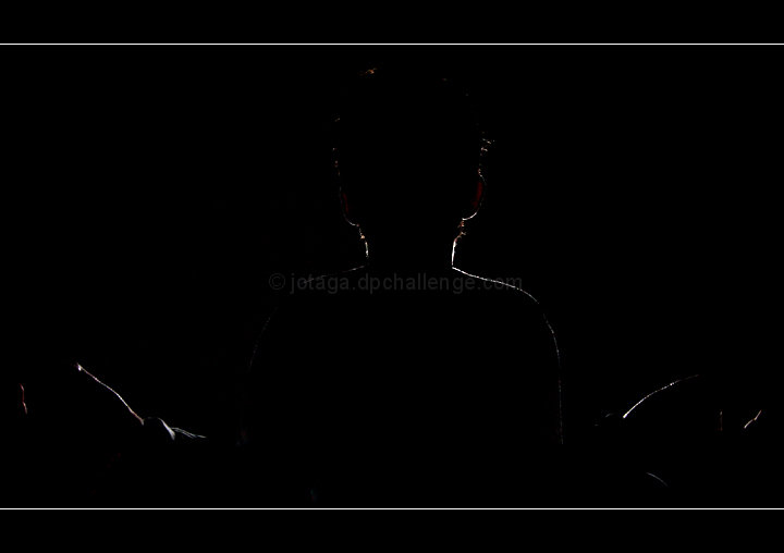
I will say that I am a fan of the image, and probably biased since Im fascinated with learing how to read auras, but as far as the image goes, its a bit too black even though I know you intended it that way since the lines stand out more. Its a good creative take on the challenge and fits the theme well, its just that the outline of the model is uneven and inconsistent throughout the frame. Maybe if you had a stronger light source, the outline would become more pronounced.
The reason why it scored under the average of 5 is because its one of those images that don't score well on DPC. Similar to impressionism, its a love or hate it image and I see you do have a favorite which is always rewarding regardless of how it scores. I would give it a 6, love the composition.
Reminds me of one of those optical illusions... when I first saw it, I saw two faces looking at each other with their mouths open. Once I looked away and back, I could see the centered person.
Very interesting. I bit too abstract for me, but I do understand where you were going with the shot. You had to have worked very hard to get the effect. I don't think I like the white lines bounding the top and bottom, but everyone to his or her own taste.







 Add photograph to your favorites
 Add photographer to your favorites

 Photographer found comment helpful.


