Greetings from the Critique Club
Susan, I've been sitting on this one a few days as I'm not sure what to say to be honest.
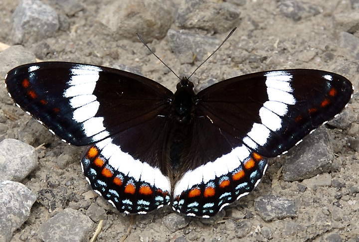
As far as photos of butterflies go, I think this is a very nice one. It could be used in a natural history catalogue. However, as far as this challenge goes, then I think it's probably not the best composition. The composition is very static and holds little interest to the viewer. As I say, it's a decent enough photo of a butterfly.
As far as exposure is concerned, it's a toughie with a high contrast subject such as this. However, I took the liberty of downloading it and managed to pull back some of the detail by tweaking the midtone levels slider. I notice in your processing steps, for this and other images, that you do not tend to use levels. I urge you to take a look at the levels adjustment layers as this one feature in PS is probably the single most useful tool when trying to make your images pop.
PM if you want some more info on using levels.
Sarah
|




 Add photograph to your favorites
 Add photographer to your favorites


 Photographer found comment helpful.


