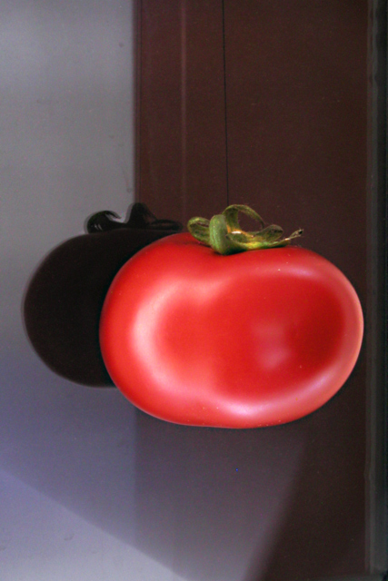
Challenge:Macro (Classic Editing) Camera:Olympus C-4040Z Location: My home Date: Nov 7, 2002 Aperture: F/10 ISO: 100 Shutter: 1/2 Date Uploaded: Nov 7, 2002
It's a nice idea to let it looks like the tomatoe is hovering in the air, but the background is way to distracting. Lighting is ok. Focus could be better. I can also see the thread ;-) -stephan
Can't really figure this one out. It looks like it could've fit in other challenges - such as reflection or suspensed or illusions or something. It looks caved in on the front and that's what caught my eye in the thumbnail. Makes it not look like a tomatoe. I see the 1/3's but that doesn't appeal here. The color is beautiful. The focus is so soft it almost looks out of focus. It's rather dar and a little too much dead space for me. But overall it is between a 5 and 6. I'm just not sure which. Right now its a 5. Will look at it again later. PTL
Something about this tomato looks sort of wrong. I believe it has to do with the circle of light on the tomato. Looks like you have a burned out pixel a little right of center and most of the way down. Good luck - Inspzil
challenge -- met technical -- love teh red of the tomatoes and that there's just a little sheen, rather than a reflection on it. nicely sharp, too. composition -- i'm trying to figure this one out. is the tomatoe on a glass surface or something? the shadow just doesn't look quite in the right place... curious to see your description on monday. -- gr8photos.
The background isn't terribly appealing and the focus isn't very sharp, but the color is very good, and the illusion of the tomato floating in space its excellent. I also like the inclusion of the tomato's shadow. Grayce
It seems a lot of people had focus problems with this challenge...including this one. Nice lighting on the tomato, though. The look of it floating is a little weird
Wicked shot! The tom looks painted (this is a good thing!) The closest thing to a complaint would be the top seems fuzzy, but really, it's a nit! 9 Swash






 Add photograph to your favorites
 Add photographer to your favorites


