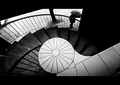
I enjoy this nod to Bresson. It's funny how much neater this is, but still has unruly dark space all around the edges. That's what makes it work for me.
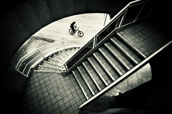
Very interesting experiment. I think it will score higher on DPC than the original might have. Mostly because it is sharper, and the lightplay on the stairs is wonderful. I have to admit that if the original showed up in a challenge and I did not know what it was, I would probably give it a 4 or 5. That does not mean it's bad, but just that it does not have the universal appeal needed to do well here.
This is a great comp. Very unique. I like the capture of the bicyclist. I like the comparison between the infocus stairs and the just slightest capture of motion with the bicyclist. It also has great framing. I wish there was a little bit more black at the bottom I guess to get a little bit more of the natural framing all around the image but that's just me (easy for me to say not being there taking the picture with only what framing is available, :) ).
I did a quick run-through of the challenge. This was the one that caught my eye immediately. I suspect this is Nick. It takes cajones to attempt to re-create something from a master - this is a very, very fine recreation. I'll go ahead and give you a 10 now, then make sure I vote the rest of the challenge so it sticks. A feast for the eyes. LOL! I'm a dork - I didn't even see the title until now. Oh, and I like the trash.
immediately makes me think of Nixter, specifically , if its not you then take that as a huge compliment as he is one of my absolute favorites on this site, and this image evokes the same great quality, 10
EDIT TO ADD, looking back on this image again, I've realized the homage to henri cartier bresson, haha, I was voting late at night and missed it, a very worthwhile 'update' and a great tribute... bumping to 10





 Add photograph to your favorites
 Add photographer to your favorites

 Photographer found comment helpful.