Challenge:Threes (Advanced Editing II) Camera:Nikon D70 Location: Village near by Date: May 26, 2004 Aperture: 4.5 ISO: 200 Shutter: 1/500 Galleries:Animals, Rural Date Uploaded: May 29, 2004
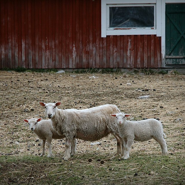
In this image, my eye is immediately attracted to your subject: three sheep. They have interesting 'poses' and fun expressions. You've managed to capture some really interesting textures, too, from the sheep, straw on the ground, and the barn. This really adds to the interest of this image.
I also very much appreciate your tones. Your darks are nice and dark and your lights are not so bright that they overwhelm the image or detract from it. Appropriately, the brightest highlights are on the sheep themselves. Texture and tone together make this a very engaging, attractive shot.
The colors here also are very nice. Somewhat muted, they give the shot an older feel, which seems appropriate for this rural life photograph. You'll want to be careful, though, when using red, for it likes to steal the show. It may do that in this case just a little, and even my slightly colorblind eyes are tempted to look at the barn instead of the sheep. So in essence, it could be that to some people, you may have two photos here: one of the sheep, and one of the interesting barn. Not only is it red, it also has some classic architectural photo qualities--you've put the window on a nice third up there, for instance. In other words, you may have competing elements in the photo.
I feel the sheep here deserve their centered position, but I'd also be tempted to try giving them some negative space to 'walk into'. This might make the photo's feel just a bit more relaxed and playful.
There is just a bit of digital noise in this photo, found mostly among the straw, which is normal. I've been dealing with this problem a little myself. Grass and straw are difficult subjects. I have found that it is sometimes best to not sharpen it, so some selective sharpening of the sheep--and nothing else, may help here, but it's not that big of a problem, and shouldn't be for a print of this, if you're going that route.
Ultimately, this is a good shot, and your decent score reflects that. Overall, I like it a lot, and am glad to have seen it in more detail this time.
how'd ya get them to look at the same time? great shot. i might prefer it with a tighter crop on top to get rid of the barn in the background. then again, i like the barn too. it might just be a little distracting?
straighten the horizon - the tilt is disconcerting - even though it is slight it makes everything lean left. With such strong horizonal lines in the background it is especially important that they be level. 6
The pose couldn't be better on these animals! I think that the image is topheavy though - there is interest in the barn which challenges the main subject.







 Add photograph to your favorites
 Add photographer to your favorites

 Photographer found comment helpful.


