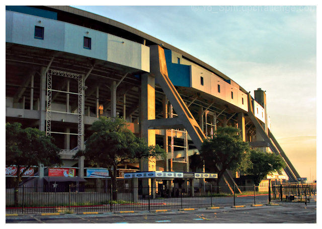
A different take on the challenge from a processing standpoint. Most of the shots posted in the challenge are high contrast with very sharp lines and overexaggerated processing and sharpness. This shot seems more pastel in approach, with soft colors (the light blues and pinks and oranges) to give this warmth, the light touching the facade in gentle ways. I think this is where your entry gets forgotten in a challenge filled with eye candy and bold lines. Here, the lines are present and visible, how the slope of the roofline puls the eyes around the corner and how the supports and trees almost seem intertwined, but the lines seem less important than other items.
I wonder if b/w would have made this more scoring friendly - but I would imagine it would not feel the same. And after taking the time to view the image, i really really like the feel - a little melancholy and a little nostalgic. Cheers! |






 Add photograph to your favorites
 Add photographer to your favorites


 Photographer found comment helpful.


