Photo Taken at around 5 p.m in the afternoon.
Taken in RAW format and converted to .dng
Upped the blacks, and contrast a bit, and tinkered with the shadows and highlights a bit.
Statistics
Place: 102 out of 153 Avg (all users): 5.0347 Avg (commenters): 6.5714 Avg (participants): 4.7358 Avg (non-participants): 5.1409 Views since voting: 982 Views during voting: 303 Votes: 202 Comments: 8 Favorites: 1 (view)
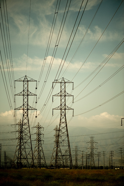
The composition is a actually very nice I love the leading lines right through the image, although rule of thumb is they should normally lead in rather than out of the shot (I think it's more an impression of the lines leading out within this shot as the cables running across the shot converge with the ones leading down and in to the scene).
The depth achieved within the shot is really quite excellent as the pylons move away in to the background, with the mountains giving the final pale layer way back there in the distance.
Camera Work:
I'm not sure if the settings posted are correct, but if so I am not sure why those particular settings would be used. For landscapes f2.8, 400 ISO and 6400 shutter just do not seem to add up and looking at the image I have to wonder if these settings have been incorrectly listed.
I'm going to assume they are listed correctly for the sake of the critique and suggest maybe more standard settings for a landscape such as this would be ISO 100 and an f-stop around f11 - f16 as there does not appear to be anything of signifance moving a very fast shutter is not really necessary.
Post-Processing:
I REALLY like the acid like toning feel to this image, kind of subdued saturation and pale colours work so well here. Sharpening has been nicely controlled with all those thin lines it would have been easy to introduce large amounts of Jaggies.
My Opinion:
Maybe a bit of a stretch to think of this as Architecture for most people, although it has great form and is nicely presented and in leading lines kind of challenge would most likely have scored much higher. I wonder if the very dark foreground cost you some points because had that been a bit more detailed there would have been more of a focal point for the viewer as I find myself straining to see what detail there is in that area.
Overall a nicely different image for the challenge but all things considered it probably finished about right for this particular assignment, however entered in a more fitting one could have done rather well IMO.
I like this although I bet you have had some DNMC comment/votes.
I like the way the cables lead us through, and as an engineer I reckon this is a form of architecture so good by me.





 Add photograph to your favorites
 Add photographer to your favorites


 Photographer found comment helpful.


