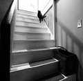
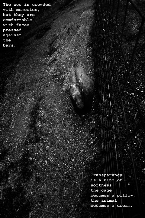
I looked more at the picture than at the words and I loved it! The black and white tones were dark and contrasty and I felt it helped enhance the sense of isolation and loneliness. I gave this a 7.
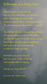
Initial impression: I think it's a lovely shot, but more of an abstract, it's quite obtuse in nature. When I voted (and gave a nice solid 5) I read the poetry and couldn't help but wonder who may have written it.
Technical: Light and pp results in quite murky results, esp considering the nature of this challenge. I love the POF, dof very good, composition is very unconventional which makes this shot more interesting. Sadly voters want to see a critter, and the more exotic the better.
Artistic: The goat gets lost against the equally dark bg; I sense a feeling of disconnect from reality with the fence being angled the way it is. Oddly bleak (no other goats/critters in sight) yet appealing. The poem is quite lovely. *finger snaps of appreciation*
Overall: Not surprised at all that it's yours, Don!
Ok I don't quite know what to make of this one. It works in a "softer world" sort of way (check out the web comic if you don't know it) but yeah it doesn't nail the "promote your Zoo" part of the challenge, it's more an artwork in its own right.
Interesting take on the challenge and perspective on this shot. You did catch the goat's eyes well. Personally I would not be attracted to this zoo ad. There is too much text that is hard to interpret and not much of interest in the picture.
Don't really get this shot, can't identify the animal, the dark tone just feels depressing, not attractive. Sorry, the concept is there somewhere, I can feel it, but the connection just isn't happening.
Very poetic. Not sure if this would really help promote a zoo. Heck, I'm not even sure what it means, but it made me pause and think, which always gets extra pointage from me.





 Add photograph to your favorites
 Add photographer to your favorites

 Photographer found comment helpful.


