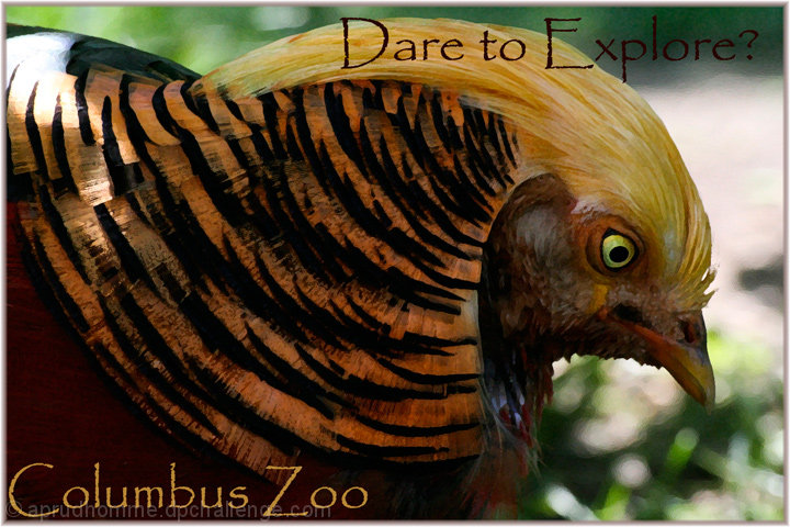
Taken at the Columbus Zoo, which I just recently found out has been ranked the number one zoo in America. This was a bird, I can't remember what type, in Asia Quest. He almost looked fake he was pretty. I adjusted the contrast, applied a paint filter to accentuate his features, and changed the exposure on his eye so it was slightly brighter. Then I just applied text, a border, changed the image size, and saved for the web.
Statistics
Place: 53 out of 87 Avg (all users): 5.7273 Avg (commenters): 6.0000 Avg (participants): 5.5122 Avg (non-participants): 5.8053 Views since voting: 842 Views during voting: 337 Votes: 154 Comments: 8 Favorites: 0
Initial impression: Lovely shot of what I believe is a golden pheasant, very vivid birds with very vivid markings and colours. I gave this a 7 in voting.
Technical: The composition is pleasing, dof good, I think the bird being in shadow is what hurt your score as lighting looks a bit flat. Sadly, zoo critters do not take direction well! ISO quite high; a lower ISO like 800 and perhaps one fstop up may have brought out the colours a bit more.
Artistic: I do like the Papyrus font. Might have cheated in the lower left block of copy, it's clinging to the edge of the border. Do like that you used black/gold for the font colours to help offset from the bg and echo the bird's plumage.
Overall/FWIW: A very good effort, and if I might suggest that after you resize (assuming you are using some version of Photoshop) apply unsharp mask, once, and one pass of sharpen edges. look at the result and if happy, save for web; otherwise you can step back and undo them to the point where you are comfortable.
Ok the post processing killed this one for me I think. I mean both a watercolour type filter AND papyrus aka one of the most over used fonts in existence.
I would be interested in seeing the original photo though and the text and layout works.





 Add photograph to your favorites
 Add photographer to your favorites

 Photographer found comment helpful.


