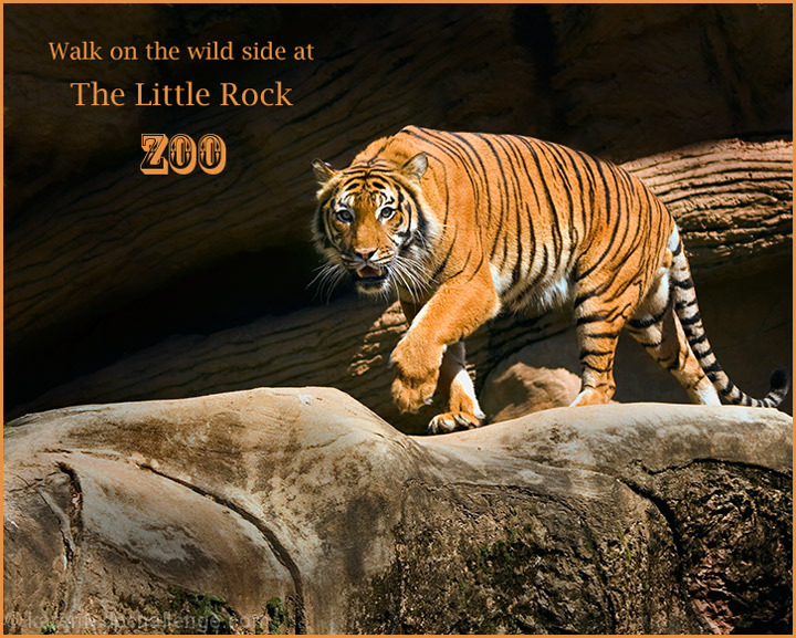
A sharp capture of menacing motion. I might have cropped right and bottom off a bit to get him a bit less centered, but that's just personal preference. (not voting)
To me, the main focus seems to have fallen on the log. Not that it's out of focus, but I think it could be a tad bit stronger on the cat. You caught his 'fangs' perfectly though and that's an added bonus. The lettering? Graphically and grammatically, I think...
Walk on the Wild Side
at the
Little Rock Zoo
...might have looked and sounded better. I'm not holding that against you 'cause it's just a matter of personal taste and nothing to do with the photography part.
You captured a good pose here! I like the striped background to show off the striped cat. If you had the room to do so, a bit less foreground and a bit more at the top make make a good composition as well.






 Add photograph to your favorites
 Add photographer to your favorites


 Photographer found comment helpful.


