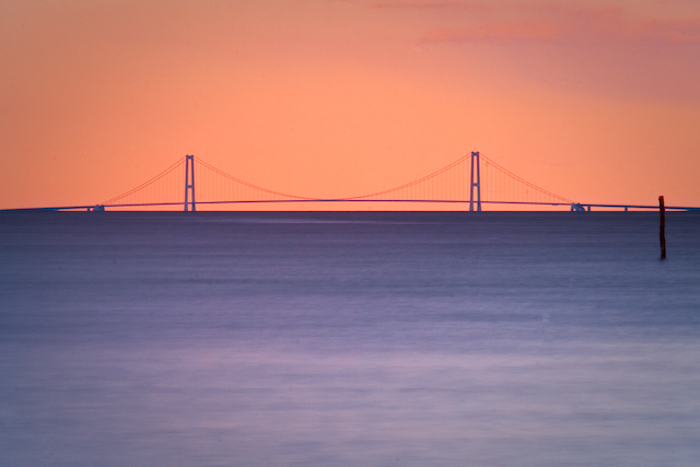
I think the composition choices here were quite limited, however presentation wise I personally think I might have cropped 3cm off the bottom and made it in to a pano style shot, for me this strengthens the draw to the bridge, for some strange reason it also limits the impact of the post sticking out the of the sea which in the original does demand quite a lot of attention. These are obviously just my opinions so please don't take offense.
Camera Work:
The technical look great, nicely exposed, great tonal range.
Post-Processing:
Nicely post processed in my opinion, it would have been very easy to over saturate this shot and for me the soft feel (not talking focus here) is a big part of the images charm. I think you have kept the image very "real" so kudos for that.
My Opinion:
I really like the image and could easily see it hanging on an office wall somewhere, it kind of exudes serenity and calm, I think if the bridge had been a little more "in your face" then it would have scored much better, whether my suggestions above would have achieved that or not I do not know, but I believe those steps are how I would have chosen to submit this shot.
Excellent! It's hard to get an original presentation of such a familiar landmark. This looks otherworldly though. Nicely abstract and excellent colors.
ETA: My only ten and my pick of the challenge. Your abstract prenetation has stripped the bridge of everything but it's most simple and basic form.
Nice pastel colours. I might crop a bit tighter; the foreground is a little dull and the brighter area at the bottom of the frame draws the eye away from the bridge, which should be the prime focus.






 Add photograph to your favorites
 Add photographer to your favorites


 Photographer found comment helpful.


