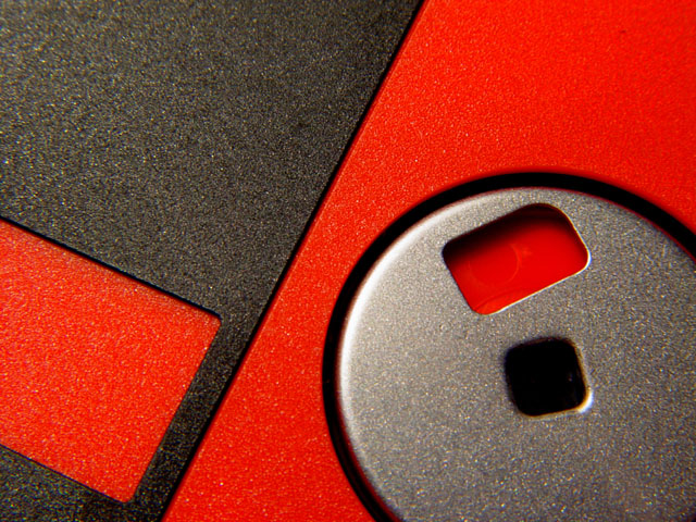
FIRST IMPRESSION: Cool, I like the play on the shapes and colors.
COMPOSITION: I'm sure there are alot of angles and crops that could be done with this subject. The one you chose is fairly good, as it balances the shot very nicely. There is close to an equilibrium between the red and the grey. The angles work nicely contrasting the circular element of the shot.
Only problem I have is with the rectangular hole within the circle. It is at a very odd angle and seems to be totally out of place. I'm not sure you would be able to fix this, other than a different crop.
TECHNICAL: There seem to be parts of the disk that are out of focus - top left corner, rim of middle circle - which may have resulted from a low aperture setting (missing in your details). Increasing DOF might solve this.
The lighting is OK, although it's not uniform throughout the photo. This causes the grey to be darker in certain areas, lighter in others. I think if the disk was lit straight on it would have worked better because it is such a 'flat' subject. You also have the left edge of that center circle over exposed - as well as the righ/bottom corner of the center 'square' - diffusing the light could have helped fixing this.
ARTISTIC: I think your choice of subject was very good. I have always liked the contrast effects of black and red (personal taste) and the linear design of a floppy with it's single circular element make it an interesting object to play with creativily.
OVERALL: Pretty good attempt at a very interesting subject. Nice enough crop and comp. Lighting needs work.
EXTRA: For these critiques to work a bit better (especially when it comes to technical aspects) it helps to know your camera settings, which are missing for this photo. If you need help finding the settings, send me a note and I will try to help you out. :)
It's a nice abstract, the colours fit well, but I don't like the grain. Not that I dislike grain always, but in this case I think it doesn't look good. -stephan
Very nice. The thumbnail doesn't do it justice. Great colors and texture. I like the angle you have used to make it abstract instead of just another floppy! I am sure you will do well.





 Add photograph to your favorites
 Add photographer to your favorites

 Photographer found comment helpful.


