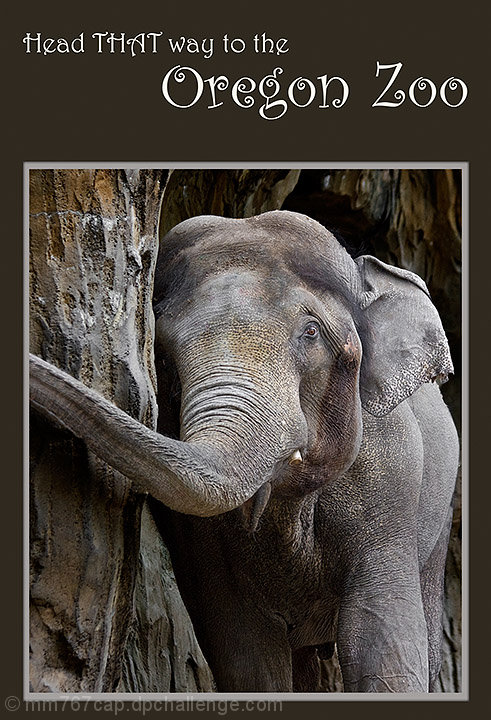
Overall your image did quite well in this challenge. A 6.3+ score is quite good, and there were very few votes below 5. While it did do quite well, there are some suggestions that I would make that I think would improve the image. I should mention though, that these are only my personal preferences, and I dont know if taking my suggestions would improve on your score, as you did do quite well.
First, I would have chosen a horizontal crop, to ensure that I did not cut off the end of the trunk. Also, I find the tight crop confining in this shot. Also, as mentioned in some of the comments, some find it oversharpened. Toning down the sharpness a tad would have kept your textures, but also kept the image feeling natural.
Overall, a very good photo, and I like that the tagline in the ad relates to the image.
Excellent idea and I love the shades of gray! Nice use of text to match the sentiment of the photo and I like the font. My only criticism would be it appears every so slightly oversharpened. Definitely could see this as a brochure cover, though.





 Add photograph to your favorites
 Add photographer to your favorites


 Photographer found comment helpful.


