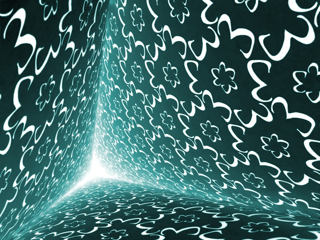
This one was a lot of work, but everything went according to plan so there was no "designing frustration". Basically, I printed three pages of this pattern of threes that I made; stapled them together; used three light sources, one for each side. Click.
I made sure to get these two threes in the corners to immediately point out that the pattern is based on the number three. Basically, this picture has three writen all over it! literally aswell as figuratively.
Post-Processing:
Inverted, desaturated, a lot of local contrast adjustment using elliptical transparencies for all three corners; local sharpening; a bunch of cloning around, recolorize.
Statistics
Place: 10 out of 205 Avg (all users): 6.6632 Avg (commenters): 7.8261 Avg (participants): 6.5798 Avg (non-participants): 6.8028 Views since voting: 7471 Votes: 190 Comments: 29 Favorites: 4 (view)
Definitely original! Seems bright to me/overexposed. If it was a bit darker then it might give the feeling that the pattern might appear floating instead.
Wow, what a nice shot. I love the sense of perspective, and you've worked threes into every aspect of the challenge, which is pretty cool. I dig this a lot -- very creative.
This is wonderful. I am so glad someone did something different. BRAVO. The light seems to suck you in like avortex. I keep hearing "run to the light" over and over again in my head. If you could create this with many different numbers it would be a great cover for a math book.
dc
A stunning graphic design with excellent colors. This should be one that no one comments that there's no 3's! It's also an optical illusion for me - sometimes the "point" seems to recede; other times it seems to be the closest to me. Great job.
Wow wow wow! I needed 3 "wows" to express how I feel about this picture. :-) Not only is this a wonderful and unique idea for this challenge, but the photo itself is amazing. I can't wait to find out how you did this. Really great job!
Lovely image. I hope you do a tutorital to explain how you did it. I love all the 3's evidenced close up. those who just vote on the thumbnails will miss it. I hope you ribbon!! 10 from me.
Psychodelic. :) It would have been easy to center the point where the lines connect - I'm glad you didn't. It splits the impact between the three "planes" stretching off into the distance with the geometric 3 patterns.





 Add photograph to your favorites
 Add photographer to your favorites


