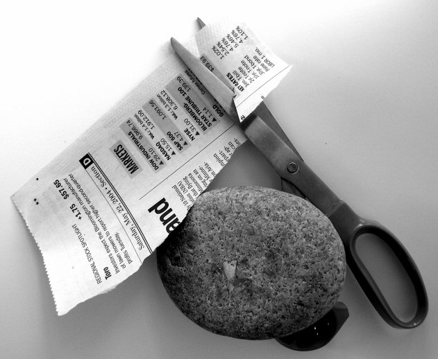
Great title and creative idea. I like the how the overlap of the paper, rock, and scissors reflects the rules of the game ;) Detail and focus are nice and the b&w works well .... 7
Definitely one of the more interesting and original entries. Lots of crisp details (slight oversharpening?) of the paper and the rock but the scissors seem a bit soft and may be due to the lighting. There are two small gray spots (one to the right of the scissors and another to the left of the paper) that should have been cloned out.
The gradation is light from the top left to the lower right seems just a bit on the high side leaving the rock and handle of the scissors just a bit on the dark side for me. Over all I think this is one of the best.






 Add photograph to your favorites
 Add photographer to your favorites


