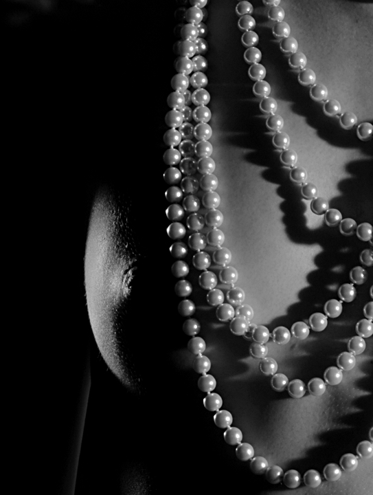
I'm not entirely happy with this one, as I think the necklace should be more to the right, and the light from camera left was too harsh and the dodge/burn does help only to some degree.
Let's find out what the commenters think.
It's from the same workshop as my darkness II entry
Convert from raw, crop, resize, USM, bw.
Statistics
Place: 275 out of 434 Avg (all users): 5.4234 Avg (commenters): 5.8333 Avg (participants): 5.2929 Avg (non-participants): 5.7632 Views since voting: 5647 Views during voting: 236 Votes: 137 Comments: 7 Favorites: 1 (view)
For some reason it seems to me that the beads are a bit out of focus- but the breast, which is essentially in the same plane, looks in focus. My opinion is that the addition of the beads would ideally add to the interest of the photo, as a subject of interest. If this is the case, I think a bit sharper focus (or is it in the PP?) would serve them well- if not, I do think they draw attention and might be pulling attention away from the female form. I do agree with your comments regarding the position- perhaps a bit further to the right in the image might be better. Other than that, the only thing I notice is that the bright light in the center of the subject's chest draws a lot of attention- whether this was your intention or not is entirely up to your artistic preference, but I do find myself looking more towards the large space between the bottom three and top two rungs of beads.
i like it, but i think that the light from the right could be softer or dimmer... because all the volume got with the left light was lost with the right one...
Funny, I gave it a five second look focusing on the pearl necklace and missed the high lighted part initially; then my brain kicked in to go back and have a second longer look. I now see the detail... higher score :)
I have to say the lighting is keen on what you are conveying.








 Add photograph to your favorites
 Add photographer to your favorites


 Photographer found comment helpful.


