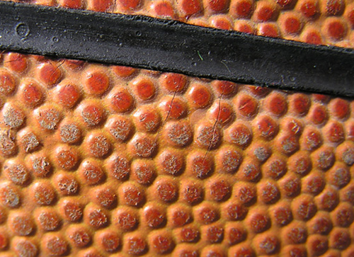
Unfortunately, I think the photo is well shot and well composed, but it just isn't interesting (at least to me, and it's just my taste). I almost think it would have been a bit better if the ball wasn't faded or used - where the colours were more vibrant. This works as an abstract, but I'd love to see richer colours. Good luck though - 6
The lighting is too flat to make the texture particularly interesting. The black stripe detracts from the unity of the rest of the composition. While it is part of the basketball, it doesn't say anything about the pattern or texture of the ball that this macro seems to be trying to make a statement about.
A very abstract shot. Hrm, I wonder what it would look like to have the black bar go from top left corner to bottom right corner spliting the image in half diagonally. As it is now, it almost looks like a bad tilt. The texture of the ball looks good, looks like it has had a lot of use.







 Add photograph to your favorites
 Add photographer to your favorites


 Photographer found comment helpful.


